Search notes:
R package: ggplot2
The ggplot2 package features a graphic paradigm which is called the »grammar of graphics«.
The package was created by Hadley Wickham, the author of »ggplot2: Elegant Graphics for Data Analysis« (Springer 2009).
Installing ggplot2
Because
ggplot2 is one of the core members of
tidyverse , the easiest way to install
ggplot2 is to install the entire
tidyverse:
install.packages ('tidyverse')
The seven parameters of the grammar of graphics
The
grammar of graphics has seven parameters that allow to create and adjust a graphic:
data
geom
mappings (Aesthetical mappings describe how variables of the data is mapped to visual properties )
stat(s)
adjustment of position (scaling)
coordinate system
a faceting scheme
library(ggplot2)

ggplot(data = a_data_frame) +
  geom_XXX(
    mapping  = aes(x = var_1, y = var_2),
    stat     = …
    position = …
  )                +
  coord_XXX ( … )  +
  facet_XXX ( … )
ggplot()
In ggplot2, a plot is started with the function
ggplot(data = ds). The
data argument specifies the
dataset to use in the graph.
This function creates a coordinate system on which layers can be added (for example geom_point(…).
Layers are added with the + operator.
geom_…()
geom…() defines how a plot represents data.
ggplot2 provides over 30 geom_*() functions. More extensions are found on
ggplot2-exts.org .
A geom_…() function takes a mapping argument. It is returned by aes(x = …, y= …).
Every geom has its default stat (for example the default stat of geom_bar() is stat_count()).
Plotting multiple geoms
Multiple geoms can be displayed in a plot by adding them
ggplot(data = …) +
  geom_…(mapping = aes(x=…, y=…)) +
  geom_…(mapping = aes(x=…, y=…))
If both mapping arguments are equal, they can be factor out:
ggplot(data = … , mapping = aes(x=…,y=…)) +
  geom_…() +
  geom_…()
aes()
The x= and y= arguments of aes(…) specify which variables of the dataset that was specified in ggplot(…) are mapped to the x and y coordinates.
The returned value of aes() can either be passed to ggplot() or a layer. If passed to ggplot(), the aesthetics become defaults for each layer.
Old parameter names are replaced with better ones: shape for pch, size for cex (etc.?).
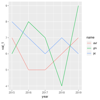
Line chart (year)
X11()

library(ggplot2)

df = data.frame (
      name   = c('abc', 'abc', 'abc', 'abc', 'abc',
                 'def', 'def', 'def', 'def', 'def',
                 'ghi', 'ghi', 'ghi', 'ghi', 'ghi',
                 'jkl', 'jkl', 'jkl', 'jkl', 'jkl',
                 'mno', 'mno', 'mno', 'mno', 'mno',
                 'pqr', 'pqr', 'pqr', 'pqr', 'pqr'),

      year   = c(2015 , 2016 , 2017 , 2018 , 2019 ,
                 2015 , 2016 , 2017 , 2018 , 2019 ,
                 2015 , 2016 , 2017 , 2018 , 2019 ,
                 2015 , 2016 , 2017 , 2018 , 2019 ,
                 2015 , 2016 , 2017 , 2018 , 2019 ,
                 2015 , 2016 , 2017 , 2018 , 2019
                 ),

      val_1  = c(   8 ,   10,    11 ,    9 ,    8 ,  # abc
                    7 ,    5,     5 ,    6 ,    7 ,  # def
                    6 ,    8,     7 ,    4 ,    9 ,  # ghi
                    8 ,    7,     6 ,    7 ,    6 ,  # jkl
                    5 ,    4,     6 ,    8 ,    9 ,  # mno
                    4 ,    6,     5,     3 ,    2 ), # pqr

      val_2  = c(   7 ,   11,     9 ,    9 ,    8 ,  # abc
                    6 ,    7,     7 ,    4 ,    9 ,  # def
                    7 ,    5,     5 ,    9 ,   10 ,  # ghi
                    8 ,    7,     8 ,    6 ,    3 ,  # jkl
                    4 ,    5,     6 ,    7 ,    8 ,  # mno
                    5 ,    7,     6 ,    8 ,    4 )  # pqr

    )

s <- subset(df, name %in% c('def', 'ghi', 'jkl'))

ggplot(data = s, aes(x = year, y = val_1, group = name, color = name)) + geom_line()

# ggsave('img/line-chart-year.png', width=12, height=12, units='cm', dpi=72)

cat ("Press enter...")
readLines("stdin", n = 1)
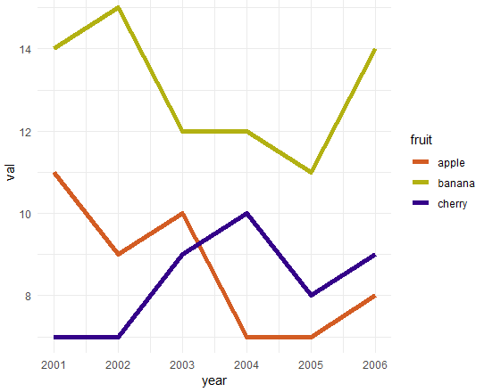
Multiple lines
The following example plots values «in parallel».
library(ggplot2)
library(tidyr  )
library(dplyr  )

data <- data.frame(
   year   = c(2001, 2002, 2003, 2004, 2005, 2006),
   apple  = c(  11,    9,   10,    7,    7,    8),
   banana = c(  14,   15,   12,   12,   11,   14),
   cherry = c(   7,    7,    9,   10,    8,    9),
   junk   = c(   3,    2,    4,    6,    3,    8)
);

gathered_data <- data                             %>%
   select (year, apple, banana, cherry)           %>%  # get rid of junk
   gather (key = 'fruit', value = 'val', -year);


ggplot(
  gathered_data,
  aes(
    x = year,
    y = val
  )
) +
geom_line(
     aes(color = fruit),
     size = 2
) +
scale_color_manual(
    values = c(
       'apple' =  '#d35c23',
       'banana' = '#b2b112',
       'cherry' = '#340289')
) +
theme_minimal(
)
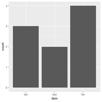
Bar chart
Count the occurences of each item:
X11()

library(ggplot2)

df = data.frame (
       item = c('foo', 'bar', 'foo', 'bar', 'foo', 'baz', 'foo', 'bar', 'baz'),
       val  = c(   9 ,    6 ,    4 ,    7 ,    6 ,    7 ,    3 ,    8 ,    6 )
)

ggplot(data = df) + geom_bar(mapping = aes(x = item))
ggsave('img/geom_bar.png', width=12, height=12, units='cm', dpi=72)

cat ("Press enter...")
readLines("stdin", n = 1)
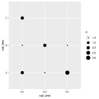
Counting combinations
The following example first creates a
data frame .
dplyr is then used to count the occurence of every combination of
val_one and
val_two. Finally,
geom_count() is used to also graphically plot the counts of these combinations.
X11()

library(ggplot2)
library(dplyr  )

df <- data.frame(
       val_one = c('foo', 'foo', 'bar', 'foo', 'bar', 'baz', 'bar', 'foo', 'baz', 'bar', 'baz', 'bar'),
       val_two = c('B'  , 'A'  , 'A'  , 'A'  , 'C'  , 'A'  , 'B'  , 'A'  , 'B'  , 'C'  , 'B'  , 'A'  )
)

df %>% count(val_one, val_two)
#
# val_one val_two     n
# <fct>   <fct>   <int>
# bar     A           2
# bar     B           1
# bar     C           2
# baz     A           1
# baz     B           2
# foo     A           3
# foo     B           1

ggplot(data = df) +
  geom_count(mapping = aes(x=val_one, y=val_two))

# ggsave('img/geom_count.png', width=12, height=12, units='cm', dpi=72)

cat ("Press enter...")
readLines("stdin", n = 1)
Using count in a data frame
The following example produces the same plot as above, but uses the count column of the data frame to specify the dot size in the plot:
X11()
library(ggplot2)

df <- data.frame(
  val_one = c('bar', 'bar', 'bar', 'baz', 'baz', 'foo', 'foo'),
  val_two = c('A'  , 'B'  , 'C'  , 'A'  , 'B'  , 'A'  , 'B'  ),
  count   = c( 2   ,  1   ,  2   ,  1   ,  2   ,  3   ,  1   )
)

ggplot(
     data    = df,
     mapping = aes(x = val_one, y = val_two)
   ) +
   geom_point(aes(size = count))


# ggsave('img/geom_point-size.png', width=12, height=12, units='cm', dpi=72)

cat ("Press enter...")
readLines("stdin", n = 1)
See also
The next iteration of ggplot2 seems to be ggvis: it has the pipe (%>%).
The ggformula package provides a formula interface to ggplot2 graphics.