Search notes:

R data visualization: scatter plot

One of the most important R function to create a scatter plot is plot.
The following example is a simple demonstration on how to do that:
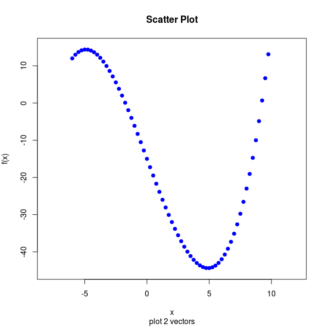
x11()

x <- seq(-6, 10, by=0.25) # c(-6:10)
y <- x*x*x/8 - 9*x -15

plot(x, y, 
    main="Scatter Plot"   , # Title
    sub ="plot 2 vectors" , # Sub title 
    xlab="x"              , # x label
    ylab="f(x)"           , # y label,
    xlim=c(-8,12)         , # range for x
    ylim=c(-45,15)        , # range for y
    col ="blue"           , # color
    pch = 19              , # 19=solid
    type="p"                # type (p = points, also possible: 
                            #       l = lines
                            #       b = both lines and points
                            #       c = b without p
                            #       o = overplotted
                            #       h = histogram
                            #       s = stair steps 
                            #       S = other steps,
                            #       n = not plotting
    )


z <- locator(1) # wait for mouse click or enter pressed
Github repository about-r, path: /graphics/data-visualization/scatter-plot/plot-2-vectors.R

type=p vs type=l

With type="p", plot produces points. This can be changed by using type="l", in which case plot will produce a line graph.

See also

Data visualization with R

Index