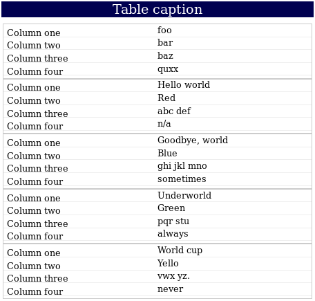
Rendering on a wide screen
If the screen is wide enough, each record (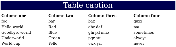
<tr>) of the table is shown in one horizontal line: <table> tag in order to create a responsive table. @media screen and (max-width: 760px) { … } so that a different (overriding) stylesheet is applied when the width of the browser is less than 760 pixels. <!DOCTYPE html>
<html lang="en">
<head>
<meta charset='UTF-8'>
<title>Responsive Table</title>
<meta name="viewport" content="width=device-width, initial-scale=1.0">
<style>
table {
width: 100%;
}
th { text-align: left }
table caption {
font-size : 2em;
background-color: #000050;
color : white;
margin-top : 0.75em;
margin-bottom : 0.4em;
}
@media screen and (max-width: 760px) {
table caption {
font-size: 1.5em;
}
/* Force table to not be like tables anymore */
thead, tbody, th, td, tr {
display: block;
}
thead tr { /* Hide headers */
display: none;
}
tr { border: 1px solid #ccc;
padding-bottom: 4px;}
td { /* Make td a row */
border: none;
border-bottom: 1px solid #eee;
position: relative;
padding-left: 50%;
}
td:before {
/* Make it like a table header */
position: absolute;
top: 6px;
left: 6px;
width: 45%;
padding-right: 5%;
white-space: nowrap;
}
td:nth-of-type(1):before { content: "Column one" ; }
td:nth-of-type(2):before { content: "Column two" ; }
td:nth-of-type(3):before { content: "Column three"; }
td:nth-of-type(4):before { content: "Column four" ; }
}
</style>
</head>
<body>
<table><caption>Table caption</caption>
<thead><tr>
<th>Column one </th>
<th>Column two </th>
<th>Column three</th>
<th>Column four </th>
</tr></thead><tbody>
<tr>
<td>foo</td>
<td>bar</td>
<td>baz</td>
<td>quxx</td>
</tr>
<tr>
<td>Hello world</td>
<td>Red</td>
<td>abc def</td>
<td>n/a</td>
</tr>
<tr>
<td>Goodbye, world</td>
<td>Blue</td>
<td>ghi jkl mno</td>
<td>sometimes</td>
</tr>
<tr>
<td>Underworld</td>
<td>Green</td>
<td>pqr stu</td>
<td>always</td>
</tr>
<tr>
<td>World cup</td>
<td>Yellow</td>
<td>vwx yz.</td>
<td>never</td>
</tr>
</tbody></table>
</body>
</html>
<tr>) of the table is shown in one horizontal line: