Search notes:

CSS: order of application of the transform property

Here is a series of four CSS transform instructions for an element:
transform         : scale(0.6)
                    translate(260px, 120px)
                    rotate(-25deg)
                    translate(-200px,  -30px)
                  ;
On Stackoverflow, there is quite a debate if these instructions are applied from left to right or from right to left.
The answer, of course as so often, is: it depends. More accurately, it depends on where the observer is located. If the observer is located on the element and undergoes the same transformations as the element, then the transformations are applied left to right.
However, if the observer is located on the element's parent element, then the transformations are applied from right to left.
I try to demenstrate in the following.

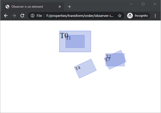
Observer is on the element

The following picture shows how the element is transformed from its initial position to the final position.
The initial position is is a box with the label T0. On this position, the scale(0.6) transformation is applied. Hence, the element shrinks to the element that is now labeled T1.
The next instruction is translate(260px, 120px). Thus the element moves by what the observer believes to be 260px/120px. But: the observer was also shrunk in the last translation, so in actuality, the real distance, as observed from an outside observer, is 40 percent less: 156px and 72px.
The element is then rotated by 25 degrees, resulting in T3. The rotation is about the point that is localized by transform-origin, which is in the middle of the element.
Finally, the element is translated again. Because the element (and the observer) are now rotated, the direction of the translation is from the element's new orientation.
The steps as produced:

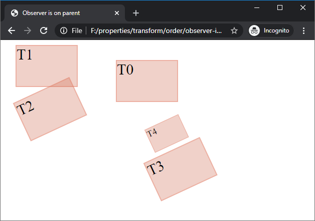
Observer is on the parent

Things are in complete opposite order if the observer is on the element's parent node (in this example, the <body> element).
The element labeled T0 is located exactly the same as in the previous steps. Now, the transormations are applied in opposite order and without moving or shrinking the observer.
First, the element is translated 200px to the right and 30px to the top, resulting in T1.
Then it is roated, resulting in T2. Note, that this time, the element is rotated about the center of the T0. This is a direct consequence of the observer not being involved in the translations.
Again, a translation moves the element to T3 and as in the previous step, the rotation does not affect the coordinate system of the translation.
Finally, the element is shrunk to T4. The center of the shinking is again in the center of T0.

HTML documents

These pictures were created with the following two HTML document:

observer-is-on-elem.html

<!DOCTYPE html>
<html>
<head>
  <meta content="text/html;charset=utf-8" http-equiv="Content-Type">
  <title>Observer is on element</title>

  <style type='text/css'>

    body {margin: 40px 230px;position: absolute}

    div {
        position        : absolute;
    }

    .elem {
        width           :    120px;
        height          :     80px;
        font-size       :     30px;
        background-color: rgba(30%, 40%, 80%, 0.3);
        border          : 2px solid rgba(40%, 50%, 90%, 0.4);
    }


   #a0 {
    }
   #a1 {
      transform         : scale(0.6)
                        ;
    }
   #a2 {
      transform         : scale(0.6)
                          translate(260px, 120px)
                        ;
    }
   #a3 {
      transform         : scale(0.6)
                          translate(260px, 120px)
                          rotate(-25deg)
                        ;
    }
   #a4 {
      transform         : scale(0.6)
                          translate(260px, 120px)
                          rotate(-25deg)
                          translate(-200px,  -30px)
                        ;
    }


  </style>

</head>
<body>

     <div class='elem' id='a0'>T0</div>
     <div class='elem' id='a1'>T1</div>
     <div class='elem' id='a2'>T2</div>
     <div class='elem' id='a3'>T3</div>
     <div class='elem' id='a4'>T4</div>

</body>
</html>

observer-is-on-parent.html

<!DOCTYPE html>
<html>
<head>
  <meta content="text/html;charset=utf-8" http-equiv="Content-Type">
  <title>Observer is on parent</title>

  <style type='text/css'>

    body {margin: 40px 230px;position: absolute}

    div {
        position        : absolute;
    }

    .elem {
        width           :    120px;
        height          :     80px;
        font-size       :     30px;
        background-color: rgba(80%, 40%, 30%, 0.3);
        border          : 2px solid rgba(90%, 50%, 40%, 0.4);
    }

   #b1 {
      transform         : translate(-200px, -30px)
                        ;
    }
   #b2 {
      transform         : rotate(-25deg)
                        ;
    }
   #b3 {
      transform         : translate(260px, 120px)
                        ;
    }
   #b4 {
      transform         : scale(0.6)
                        ;
    }

   #b0, #b1, #b2, #b3, #b4 {
      transform-origin: 60px 40px;
   }

  </style>

</head>
<body>


     <div id='b0'> <div class='elem'>T0</div>
    </div>

     <div id='b1'>
     <div id='b0'> <div class='elem'>T1</div>
    </div>
    </div>

     <div id='b2'>
     <div id='b1'>
     <div id='b0'> <div class='elem'>T2</div>
    </div>
    </div>
    </div>

     <div id='b3'>
     <div id='b2'>
     <div id='b1'>
     <div id='b0'> <div class='elem'>T3</div>
    </div>
    </div>
    </div>
    </div>

     <div id='b4'>
     <div id='b3'>
     <div id='b2'>
     <div id='b1'>
     <div id='b0'> <div class='elem'>T4</div>
    </div>
    </div>
    </div>
    </div>
    </div>

</body>
</html>

Index