object-fit: contain
With
object-fit: contain, an image is shown as large as possible but without distorting its aspect ratio.
The following HTML document embeds an
<img> element with an associated object-fit: contain. The image is 400 by 300 pixels in size. <!DOCTYPE html>
<html>
<head>
<meta content="text/html;charset=utf-8" http-equiv="Content-Type">
<title>CSS property: object-fit</title>
<style type='text/css'>
body {
height : 100vh;
margin : 0;
}
#obj {
object-fit: contain;
width : 100%;
height : 100%;
margin : 0;
}
</style>
</head>
<body>
<img id='obj' src='400x300.png' />
</body>
</html>
Github repository about-CSS, path: /properties/object/fit/contain.html
When the browser window is resized, the image is resized as is shown below.
Browser window is too wide for image: 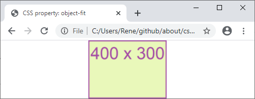
Browser window is too high for image: