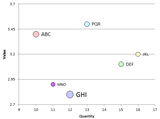
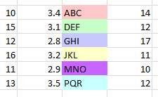
Source data
The following is the source data for the scatter plot.
The first column contains the x-values (the quantity).
The second column contains the y-values corresponding to the quantity.
The third column contains the label for the data points. The background color is used by the VBA function to color the data point in the result.
The fourth column contains the size for the data point.
The VBA program
The following VBA program first creates the data (
function createTestData) and then iterates over each row of the test data to format the data points in the resulting scatter plot.
option explicit

public sub main() ' {

    dim sh as Worksheet
    set sh = worksheets.add

    dim firstRow    as integer
    dim lastRow     as integer
    dim firstColumn as integer
    dim lastColumn  as integer

    firstRow = 2
    lastRow  = firstRow + createTestData(sh) - 1

    firstColumn = 1

    dim rows as integer
    rows = lastRow - firstRow + 1
    dim columns as integer
    columns = lastColumn - firstColumn + 1

  ' Identify the range containing the plot data
    dim dataRange as range
    set dataRange = range(cells(firstRow, firstColumn), cells(lastRow, firstColumn + 1))

    dim ch as chart
    dim co as chartObject

    set co = sh.chartObjects.add(60, 140, 400, 300)

    set ch = co.chart

    ch.chartType = xlXYScatter
    ch.setSourceData source := dataRange
    ch.location where := xlLocationAsObject, name := sh.name

    ch.hasLegend = false
    ch.plotArea.interior.color = rgb(255, 255, 255) ' xlNone

  ' Name the x-Axis:
    ch.axes(xlCategory).hasTitle = true
    ch.axes(xlCategory).axisTitle.text  = "Quantity"

  ' Name the y-Axis:
    ch.axes(xlValue).hasTitle = true
    ch.axes(xlValue).axisTitle.text     = "Value"

    dim  ptNo  as integer

    dim dataSeries as series
    dim dataPoints as points
    dim dataPoint  as point
    set dataSeries = ch.seriesCollection(1)
    set dataPoints = dataSeries.points

    dataSeries.applyDataLabels

    for ptNo = 1 to rows ' {
      '
      ' Iterate over data points in order to
      ' format each of them:
      '
        set dataPoint = dataPoints(ptNo)
        dataPoint.dataLabel.text = sh.cells(ptNo + firstRow - 1, 3) ' What is the difference to dataLabel.caption ?

        dataPoint.markerStyle = xlMarkerStyleCircle

        dim pointColor as long
        pointColor = sh.cells(ptNo + firstRow -1, 3).interior.color

      '
      ' Setting the points's color. When using RGB values, this can be done with
      ' the .marker*groundColor property. Alterntively, with the
      '.marker*groundColorIndex, a color could be cdhosen from an index.
        dataPoint.markerBackgroundColor = pointColor
        dataPoint.markerForegroundColor = rgb(20, 20, 20)

      ' Set point and text size
        dim pointSize as long
        pointSize = sh.cells(ptNo + firstRow -1, 4)

        dataPoint.markerSize = pointSize
        dataPoint.dataLabel.format.textFrame2.textRange.font.size = pointSize
    next ' }

  '
  ' Adjust axes.
  '   Apparently, this is necessary if xMax/6*5 > xMin and/or
  '   yMax/6*5 > yMain
  '   https://peltiertech.com/how-excel-calculates-automatic-chart-axis-limits/ has
  '   more details.
  '
    ch.axes(xlValue   ).minimumScale = 2.7
    ch.axes(xlValue   ).maximumScale = 3.7
    ch.axes(xlValue   ).majorUnit    = 0.25
    ch.axes(xlValue   ).minorUnit    = 0.2

    ch.axes(xlCategory).minimumScale =  9
    ch.axes(xlCategory).maximumScale = 17
    ch.axes(xlCategory).majorUnit    =  1
    ch.axes(xlCategory).minorUnit    =  0.5

  '
  ' Unselect selected range:
  '
    sh.cells(1, 1).select
    application.cutCopyMode = false

end sub ' }

function createTestData(sh as worksheet) as integer ' {

  '            X-Value :             Y-Value :                 Label |                                   Color for point  : Point size
     sh.cells(2,1) = 10 : sh.cells(2,2) = 3.4 : sh.cells(2,3) = "ABC" : sh.cells(2,3).interior.color = rgb(255, 200, 200) : sh.cells(2,4) = 14
     sh.cells(3,1) = 15 : sh.cells(3,2) = 3.1 : sh.cells(3,3) = "DEF" : sh.cells(3,3).interior.color = rgb(200, 255, 200) : sh.cells(3,4) = 12
     sh.cells(4,1) = 12 : sh.cells(4,2) = 2.8 : sh.cells(4,3) = "GHI" : sh.cells(4,3).interior.color = rgb(200, 200, 255) : sh.cells(4,4) = 17
     sh.cells(5,1) = 16 : sh.cells(5,2) = 3.2 : sh.cells(5,3) = "JKL" : sh.cells(5,3).interior.color = rgb(255, 255, 200) : sh.cells(5,4) = 11
     sh.cells(6,1) = 11 : sh.cells(6,2) = 2.9 : sh.cells(6,3) = "MNO" : sh.cells(6,3).interior.color = rgb(200, 100, 255) : sh.cells(6,4) = 10
     sh.cells(7,1) = 13 : sh.cells(7,2) = 3.5 : sh.cells(7,3) = "PQR" : sh.cells(7,3).interior.color = rgb(200, 255, 255) : sh.cells(7,4) = 12

     createTestData = 6

end function ' }